Problems & Solutions
There are many medical diagnostics/referencing applications out there (e.g. Symptomia, Critical Care ACLS, etc.). However, some of these applications are exclusive to one OS, not user friendly and does not cater to all kinds of medical staff and/or students. By designing this application, I offer medical staff and students a quick, responsive, and efficient web-app for the medical and education industry.

Symptomia

Eponyms
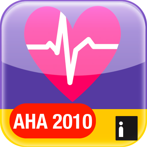
Critical Care ACLS Guide
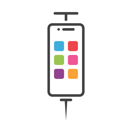
Pedi STAT
Roles & Responsibilities
Our final year project requires us students to design and develop by ourselves with included guidance from our supervisor. In terms of the design role, I was responsible for conceptualisations, iterations, prototyping, interaction design research, user-centred design research and collecting quantitative and qualitative data.

Process
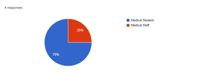
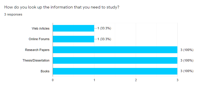
User Research – Quantitative Method
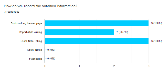
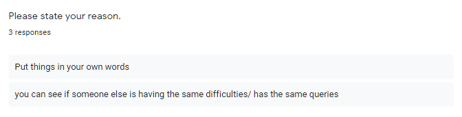
I identified issues and standard workflows for medical staff and medical students via survey and interviews.
User Research – Qualitative Method
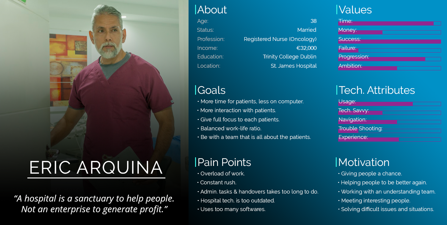
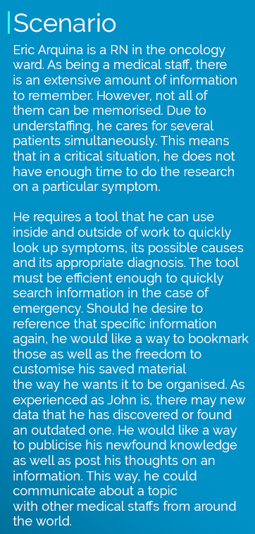
A persona and scenario is created to allow me to make important UX decisions throughout the design process.
Designing the Application – Wireframes
Wireframes are iterated to plan out contents and functionalities per page of the web-app in terms of the user needs and user journeys.
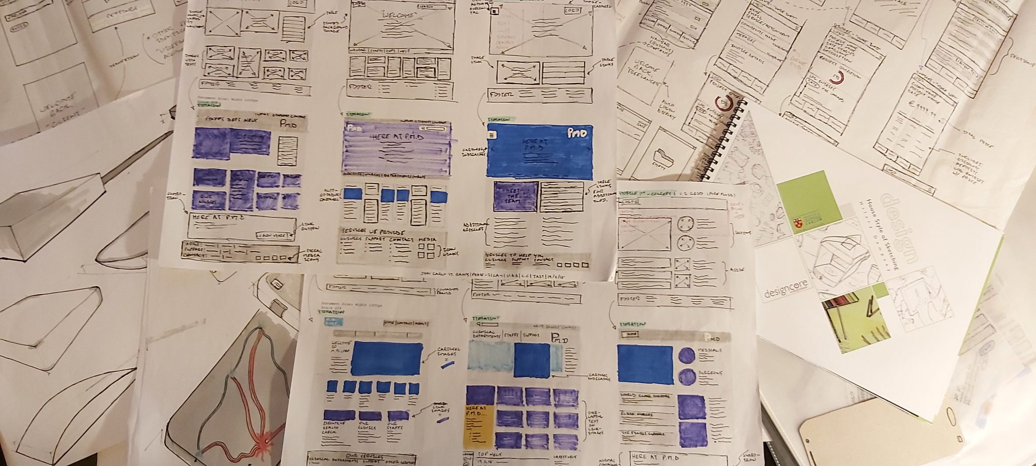
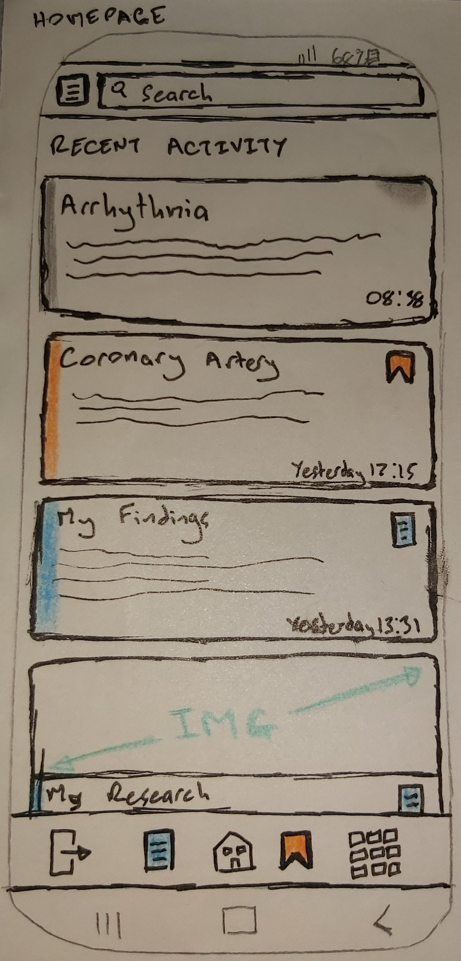
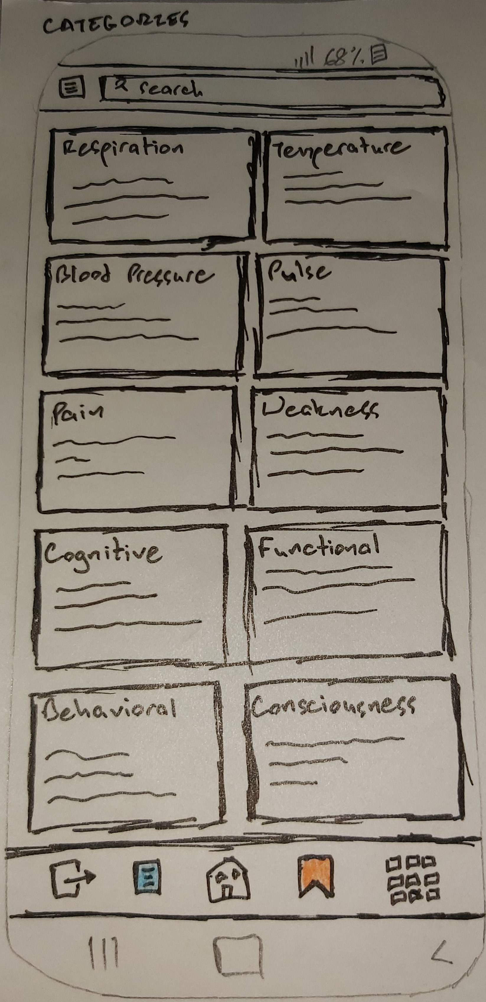
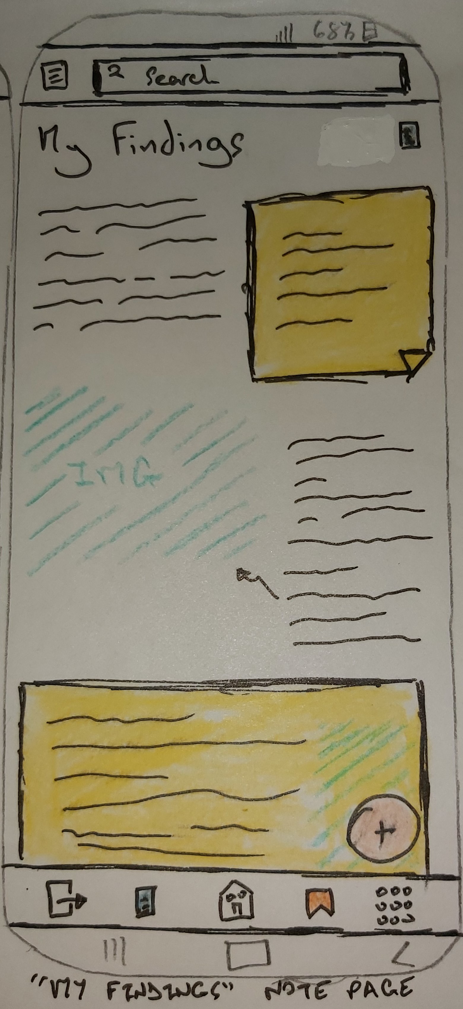
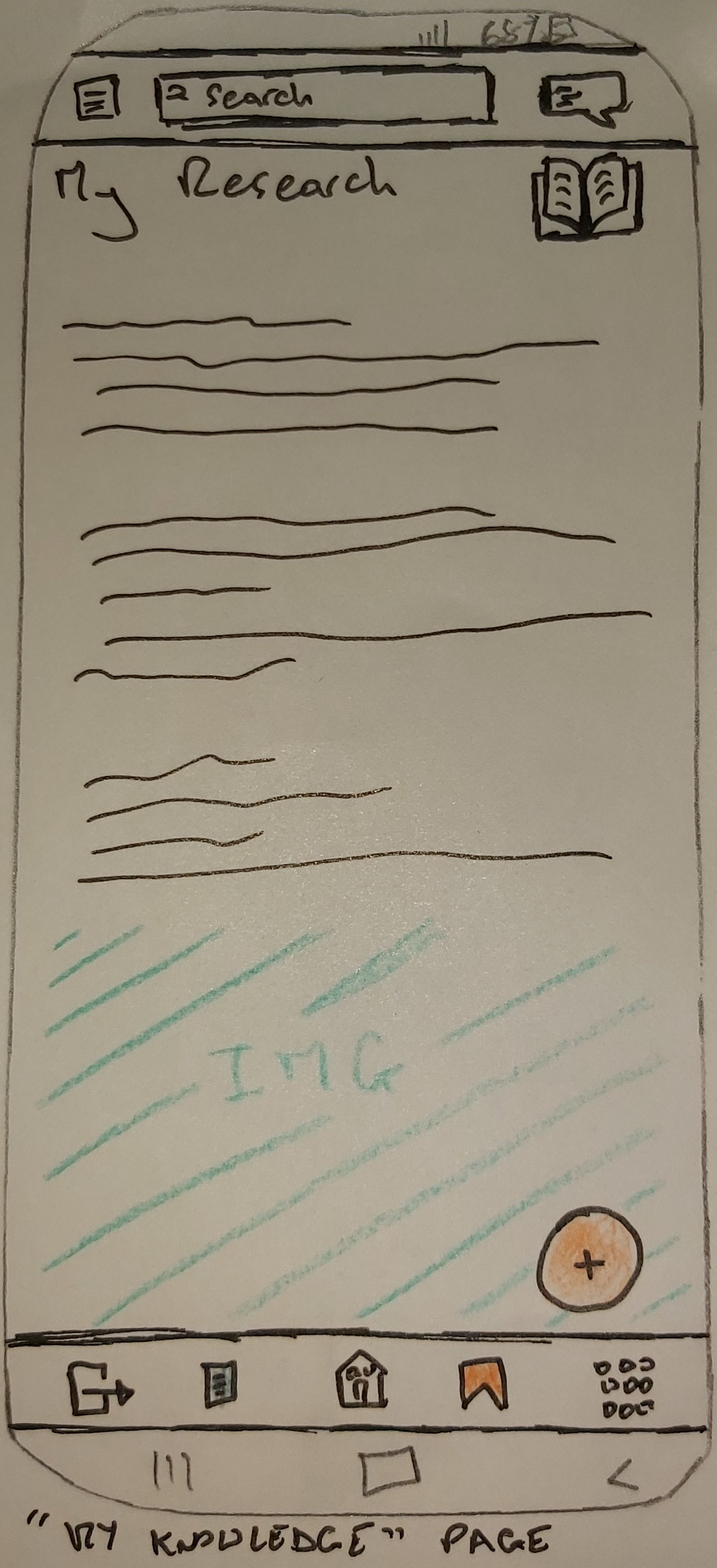
Designing the Application – Paper Prototype
Multiple iterations of Lo-Fi Prototypes were made to find out how the users would behave with the product as well as to potentially reveal new solutions to the problems.
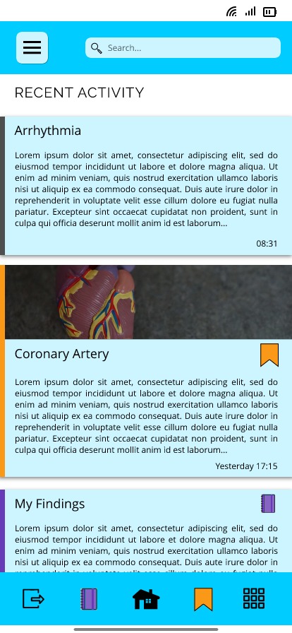
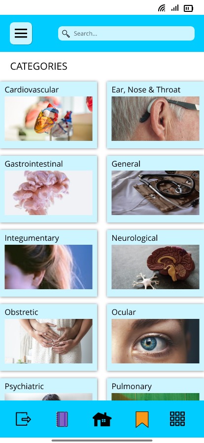
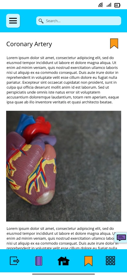
Designing the Application – Hi-Fi Prototype
A number of Hi-Fi Prototypes were designed to get detailed feedback on specific elements of the product that can't be obtained by using the Lo-Fi Prototype.
Heuristic Evaluation on Hi-Fi Prototype:
Visibility of System Status:
User will be notified by a badge on the comment sidebar button
if another user has replied on their comment or has commented on
their published information.
User Control and Freedom:
User may simply navigate through the pages via bottom navigation
bar and left sidebar (for user profile). Also displays speed
dial buttons to easily CRUD their notes/published information.
Placement of comment section could be improved.
Error Prevention:
No error prevention has is displayed.
Flexibility and Efficiency of Use:
As explained in User Control & Freedom, the important features
are within easy reach.
Recognise, Diagnose and Recover from Errors:
None has been displayed.
Match Between System and Real World:
The icons portrayed notifies the user on what they contain in
those pages without using too much texts. Hence simplicity and
clarity.
Consistency and Standards:
The U.I is consistent.
Recognition Rather than Recall:
The app’s homepage displays the user’s recent activity.
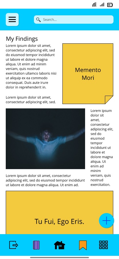
Aesthetic and Minimalist Design:
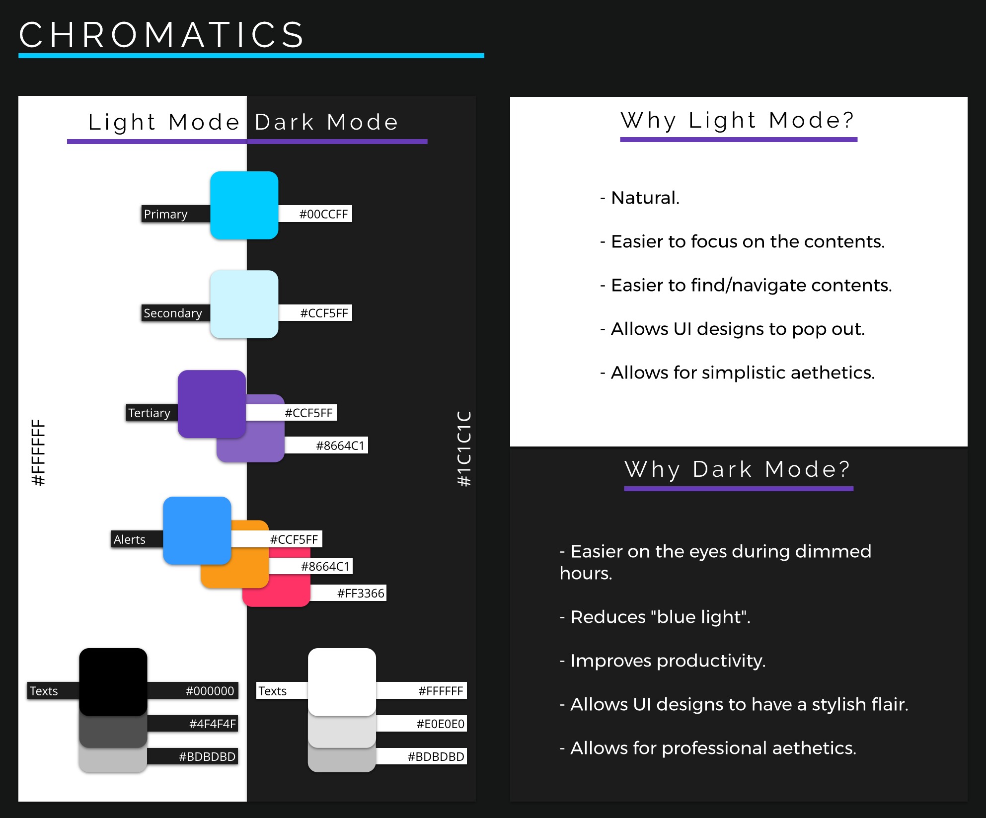
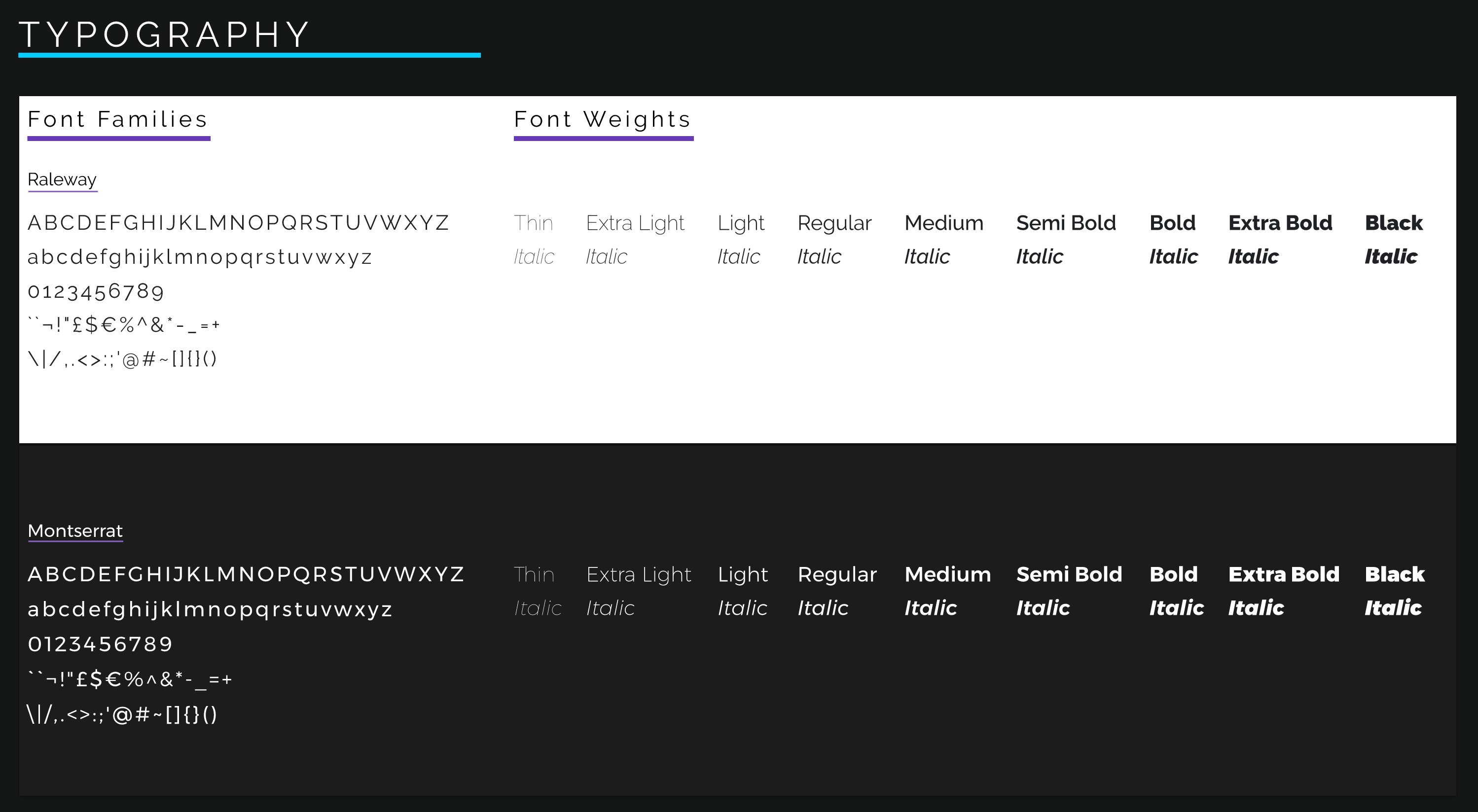
The use of medical-inspired chromatics are vivid as well as the
use of the Raleway and Monsterrat font families. Each section
(i.e. notes, published info and bookmarked info) are colour
coded as well as having their own assigned icons.
Help and Documentation:
A settings menu within the left sidebar contains the “About”,
“Contact Us” and “Privacy” pages. However, instructions on how
to use the app’s features is absent.
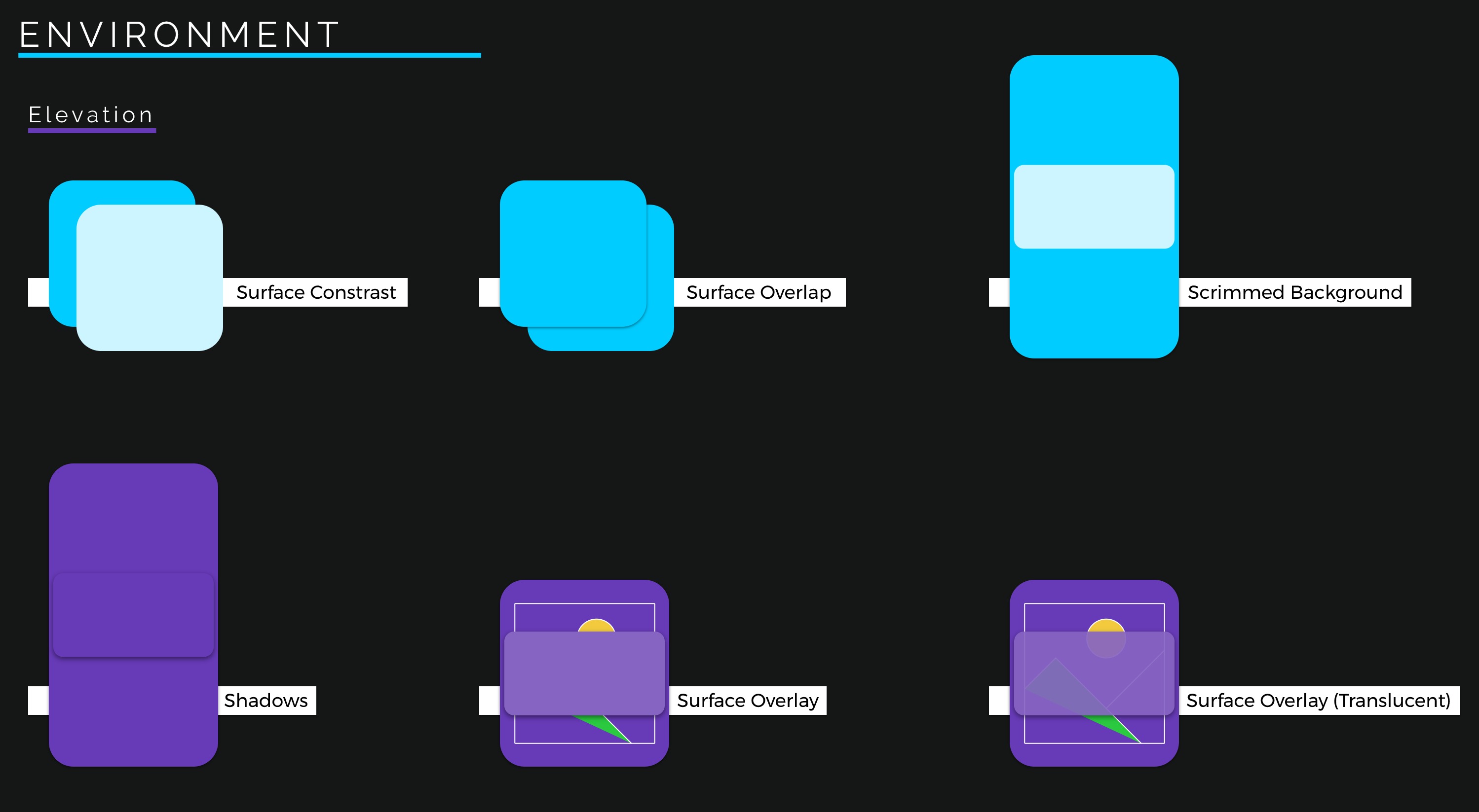
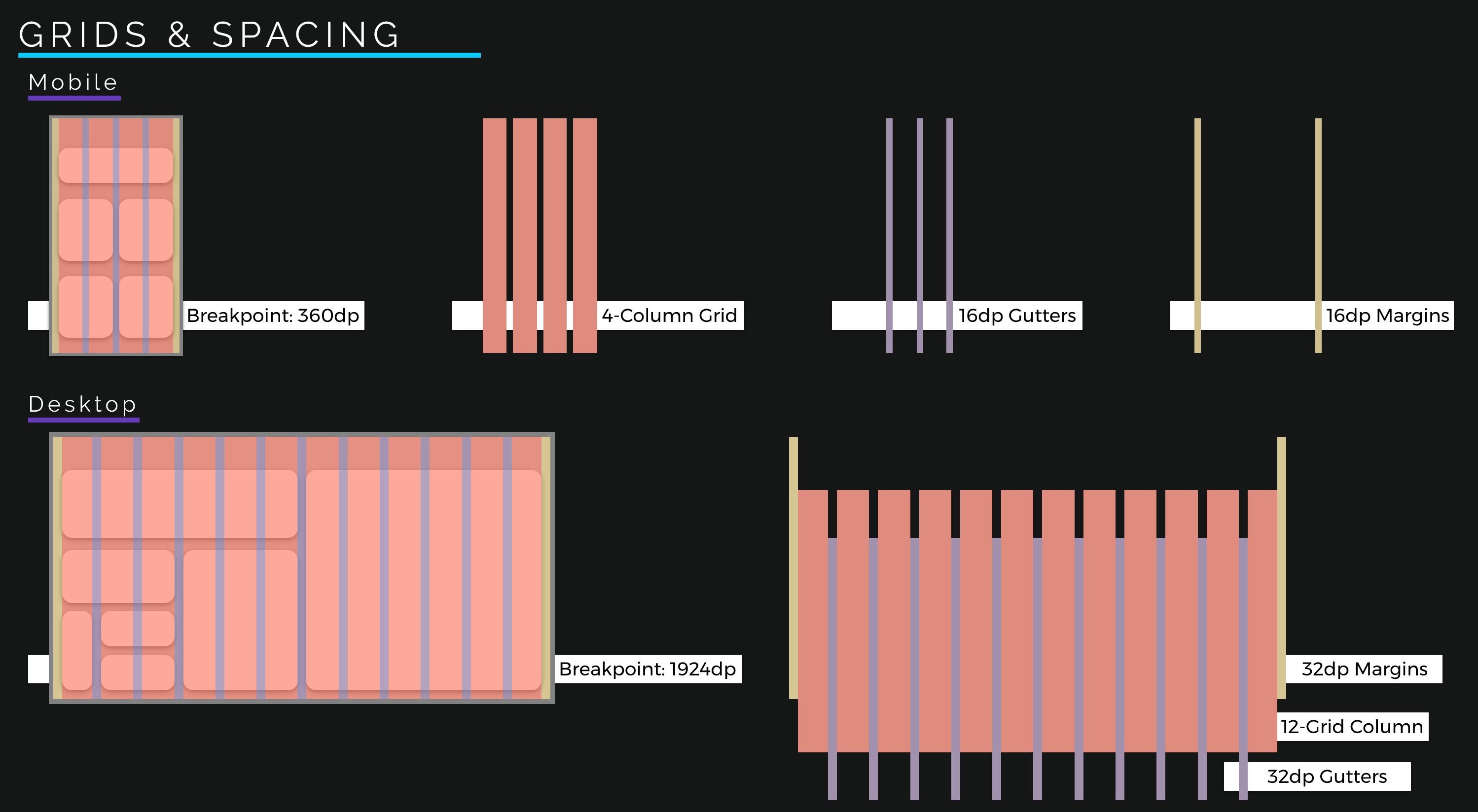
Style Guide
I have designed a style guide to ensure a consistent brand experience throughout the product.
Outcomes
No outcome has been made as the Auxillia Diagnostics project is currently still in progress.